Improving your digital presence is an adventure. Let us guide you through it.
Contact us using the form below and one of our team members will reach out as soon as possible.
(*) - Required field

Right now is the perfect time for a website audit. Check out these 8 issues that could be hurting your business and undermining your goals, and then get serious about fixing them.
New year, new goals. That goes for everything from health and wellness to ways that you’re going to supercharge your business in the next 12 months. But where should you start?
Did you know that your company website is often the first and best way that you communicate with current or potential customers? Even if they find you on social media, the goal is always to bring them back to your website or a specific landing page that’s tailor made to capture their interest. What will they find when they get there? Will your website pull them in or push them away?
Right now is the perfect time for a website audit. Check out these 8 issues that could be hurting your business and undermining your goals, and then get serious about fixing them. The professional team at Alt Media Studios is here to help along the way.
Website visitor information is an invaluable goldmine and the best part is that they willingly share it, if the parameters are right. If you have online contact forms built into your website and you aren’t getting the leads you were expecting to, these could be some reasons why:
The key is to make it easy, keep things simple, and be as clear as possible. Show site visitors what they can gain, and limit the information you’re requesting from them.
In general, the best-performing contact forms are usually very short. A good rule of thumb to follow is to include ideally 3–5 fields for most website contact forms. The temptation could be to try and gather every bit of relevant information you can, but here’s why less is more:
Beyond keeping things brief, other best practices–which often matter more than the quantity of fields–include:
Each person is different in what they feel to be balanced or intrusive when it comes to sharing their personal information. So this likely won’t be a once-and-done process. If numbers are telling you that your current content form is hurting conversions, that’s when you spend time testing. Remove one field, test again, and compare. Ongoing testing will help you to find a happy medium where you get the information you’re seeking and site visitors are happy to share.
One last note–leave form submitters with a clear expectation. Something like, “We’ll contact you within 24 hours.” That clear next-step messaging keeps them engaged and ready to interact. Then, of course, follow up as promised.
We’ve all been there. We clicked on a website, and when it didn’t load immediately or had a long lag time at scroll, we backed out and looked elsewhere. If we do this, then we know that our customers are doing it too. In fact it’s well known that all users (but especially mobile users) will leave if a page takes more than ~3 seconds to load.
Here are some common causes that are typically behind slow page load times:
It’s a simple fix, really. First of all, images on your website need to be compressed so that they hold less information and put less of a demand on the user’s bandwidth. This helps to level the playing field, and makes it easier for pages to load, regardless of the type of device the user has or the strength of their internet connection.
Beyond image compression, the code behind the software that builds your website needs to be optimized. This allows your website to work more efficiently without sacrificing functionality. There’s a lot involved behind the scenes to make this work, but the end result is faster loading and reaction times, resource efficiency, and lower power consumption, to name a few. To support these key changes, you also need to use performance-optimized hosting for your website.
Estimates put “smartphone-only” adult internet users at roughly 15-20% of the U.S. population. Besides these folks, up to 90% of your potential customers are using their mobile devices in addition to standard desktops. And mobile website traffic makes up 60% or more of all total online use. It’s clear that most users are browsing on mobile devices at some point. They’re used to good load times and performance on more traditional laptops and desktops, so if a site is hard to navigate, zoom, or read on mobile, they’ll leave.
Common issues that can lead to a poor mobile experience:
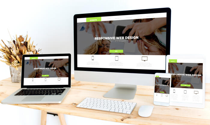
To ensure that you’re able to appeal to as wide a customer base as possible, a mobile friendly website is a must.
The answer is pretty simple, but the execution takes some skill. To ensure that you have a mobile friendly website, you need to design with a mobile-first approach and test the site at various stages on multiple devices–mobile and desktop. Verify that the website looks good and operates well on all devices and keep up to date with shifting parameters.
This sounds easier than it is. It takes a true-blue expert in custom web design to ensure that you have a mobile friendly website from day one. If you choose Alt Media Studios when deciding on a partner for web design in Cleveland, you can rest assured that mobile friendliness is in the bag.
When any given user visits a website, they don’t want to have to hunt around for information. Instead, they want to know right up front what’s being offered and how they can get the details they’re searching for. Calls to action (CTAs) can help these website users, or they can frustrate and deter them.
CTAs can cost you leads when visitors don’t know what to do next. For example, some weak or unclear CTAs could be something like:
In theory, this is an easy fix. But it takes an expert’s eye to ensure that you’re doing it right.
When you’re trying to attract the attention of site visitors in hopes of achieving conversions, you’ll want to use clear, action-oriented CTAs. Common examples can include statements like:
The ideal CTAs vary across service and product offerings and business types. But no matter what you choose, you want it to be appropriate for the action you’re trying to prompt, obvious to site users, and easy for them to engage with. The best CTA is the one that gets a site user to interact with your business, and that can take time to get right.
If you regularly use a website, you know exactly where to go to get the information or access you need. But if you were a new user, would you be so confident? New visitors to your website should be able to easily find their way around. If they’re looking for your contact information, lists of products and services, answers to commonly asked questions, or examples of your work, they should be able to readily find that information on your website.
On the other hand, if users can’t quickly find what they need, they will likely abandon the site. Unclear navigation and page structure can cost you valuable leads. Common problems that could cause a site visitor to leave can include:
A good rule of thumb when taking on custom web design is to anticipate the types of information that clients will be looking for and ensure that menu items clearly address these in an organized way.
If you didn’t know everything about your business, would it be easy for you to find key details on your website? Now is the time to take an objective look at your website. If you realize that it could (and should) be easier for site visitors to find what they are looking for, there are some simple fixes that can be done behind the scenes. These include:
Out-of-the-box website building products abound, but when you want a specific layout and clear navigation, you need to work with a digital marketing agency that specializes in custom web design.
We’ve all been there–we land on a website while searching for a product or service and something just feels “off.” The language is odd or awkward, and it’s missing key factors that inspire trust. If this describes the impression that your website gives to a new user, it’s probably costing you leads.
This is because new website visitors will hesitate to share their information with a business that doesn’t easily gain their trust. Some top missing trust elements that could be driving potential customers away can include:
The fix is easy, but it might take some finesse to make it look like the information is coming from a trusted source. Work with your custom web design professionals to add the following to your website:
If you tend to use stock images and videos instead of professional photography and videography, or you haven’t taken the time to include customer testimonials or link to your Google business profile on your website, what are you waiting for? Make some changes now to prove your trustworthiness and to help convince site visitors to become customers.
Visual hierarchy? Yep, it’s a fancy sounding term for something that humans do without even trying. We automatically assign importance to elements presented to our eyes based on how they contrast with each other. If everything has the same visual weight, we don’t know where to look first. If contrast is overdone, we can focus more on the visual disparities than the information being presented. And if there’s just too much to look at, that can turn us off too. It’s a fine balance. A balance that experienced custom web design and graphic design professionals understand well.
These are some things to look out for when evaluating whether or not your company’s website could benefit from a layout or design overhaul:
When it’s done properly, a website feels light and easy on the senses. But when done poorly, web design can lead users to get easily overwhelmed and miss key information or navigate away from your page entirely–that will cost you leads to be sure.
Web design trends come and go, but the classic choices that put site users and visitors first will always be in style. Some key inclusions to ensure that visual hierarchy and design are what they should be include:
Get with Alt Media Studios to learn how our team can make your website stand out in a good way. Our custom web designers and graphic designers will work with you to develop a style guide that fits your brand and conveys the message you want to share.
When a visitor lands on your website, you have mere seconds to engage with them. The most work on this front is done “above the fold”–the portion of your website that they see on their device without scrolling. This is the most valuable real estate on any given page on your website, but if designed incorrectly, it could alienate the very people you are trying to attract.
If visitors don’t immediately understand what you offer or why you’re different, they will go elsewhere to find what they’re looking for. Clearly, you need to have key information available above the fold if you don’t want to forfeit leads.
Whether it’s a home page, product page, about us page, or a specific landing page that’s bringing folks over from a social media platform, people need to see some key information available, right off the bat.
Within the first 5 seconds of time spent on a given webpage, site visitors should be able to clearly answer the following:
With some strategic and targeted attention, you can ensure that website visitors find the information they’re seeking and are ready to engage with your business.
At Alt Media Studios, we know what it takes to build an effective, efficient, eye-catching but easy-to-use website. We understand that user experience is at the heart of any good custom web design. So we employ all our experience and expertise to ensure that each and every website we build for our clients is focused on sharing key information and being responsive to the online searches that bring visitors to their websites. Beyond getting eyes on your website and company, we also handcraft a website that accurately reflects your company ethos and industry.
When it comes to professional web design services, look no further–the pro team at Alt Media Studios is here to help. Contact us today to get started on your website revamp.
Not every in-your-face trend is worth following. Here we’ve curated some of our top suggestions based on what we’ve seen work for our clients and their customers. The focus is (or should be) on website users, after all.

Ever think to yourself, "Why should I work with a digital marketing agency when I can do this myself?” Well, let's answer that question, and look at a real life cautionary tale.

Optimization of images holds a critical role in enhancing the performance of your website. By tailoring your images to be web-friendly, you not only ensure swift loading times but also deliver an improved user experience.