Improving your digital presence is an adventure. Let us guide you through it.
Contact us using the form below and one of our team members will reach out as soon as possible.
(*) - Required field

Why should you pay special attention to the typography design on your website? Studies have shown that it has a powerful effect on your site visitors’ focus, comprehension, and perception of your content.
Typography is the art of type that adds personality and style to your text. The key elements of typography include font face, font size, line length, letter and line spacing, contrast, headings, and characteristics like bold and italicized type.
So why should you pay special attention to the typography design on your website? Typography is important to digital marketers because studies have shown that it has a powerful effect on your site visitors’ focus, comprehension, and perception of your content. As a result, the typography on your website can influence bounce rates, online conversions, and how consumers view your company.
Attention spans continue to dwindle. Scientific studies have shown that most of us only scroll through half of the content on a web page, if that. But even before we start reading content, we tend to first scan the page as a whole, taking note of how the information is presented, the size of the letters, the lengths of the lines, etc. Then we subconsciously judge whether or not the content is relevant to us and if it’s worth reading.
The 2018 National Health Interview Survey (NHIS) established that about 13% of adult Americans reported having vision problems¹. That means that roughly 1 out of every 8 adults visiting your business’ website has difficulty seeing. Moreover, the CDC reports that “vision disability is one of the top 10 disabilities among adults 18 years and older.”² Numerous studies have shown that people take action more quickly when those actions require less effort. So the easier your site is to read, the higher the likelihood that consumers will be motivated to convert.
Typography done right can also make it easier for readers to process and understand the information you’re trying to convey—and vice versa. Copy that is well-formatted ensures that the reader stays focused on the content. You want readers to remember your message and call-to-action, not the typeface.
Interestingly, the typography on your website also influences how users interpret your marketing messages and view your brand. Consider one 2012 experiment performed by Errol Morris.⁵ 40,000 participants were presented with a passage from David Deutsch’s book The Beginning of Infinity. After reading the passage, readers were asked two simple yes-or-no questions:
However, Morris was not interested in what people thought about Deutsch’s claim. He wanted to know if the typeface of the passage would influence whether or not the readers perceived the information as credible. The same passage was presented in six typefaces:
What were the results? Statements in Comic Sans and Helvetica inspired the highest amount of disagreement. Meanwhile, people were more likely to agree with the statement when it was presented in Baskerville.
So does this mean that Baskerville is a magical font that will always convince your readers? No. However, in this situation, Baskerville did look and feel more formal, which made Deutsch’s statement more authoritative. The takeaway is clear: the fonts you select for your website, social media images, and marketing materials can have a surprisingly profound psychological impact on your potential customers. Typography not only affects whether or not users will read and engage with your content - it also has the power to influence whether or not they will view your business as credible and trustworthy and if they’ll agree with your company values.
Is your website content easy for users to scan, read, and understand? Does your website typography impart the right amount of authority and create the right associations in the minds of your site visitors? If you’re unsure, how can you find out? The answers lie in A/B testing. Rather than making arbitrary assumptions about how you think your website typography is affecting online conversions, your best bet is to perform data-driven, unbiased tests on elements such as typefaces, font sizes, content formatting, etc. The winner of your tests will be the element that clearly correlates with the most conversions. No idea where to start with A/B testing? Partner with our team here at Alt Media Studios for expert web design and A/B testing that will optimize your conversion rates and help your business thrive online!
¹ https://www.afb.org/research-and-initiatives/statistics
³ https://www.smashingmagazine.com/2011/10/16-pixels-body-copy-anything-less-costly-mistake/
⁴ https://neilpatel.com/blog/how-typography-affects-conversions/
⁵ https://opinionator.blogs.nytimes.com/2012/08/08/hear-all-ye-people-hearken-o-earth/
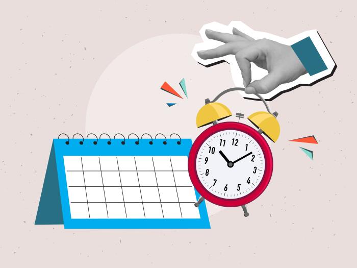
The old proverbial slow-but-steady approach is the way to go. Here’s what the SEO experts at Alt Media Studios have to share about a realistic SEO timeline.

Once you know the time of year that typically brings in the most business for you, it’s vital to capitalize on that opportunity. We have advertising and digital marketing down to a science, and we’re here to share some key tips about timing.

Right now is the perfect time for a website audit. Check out these 8 issues that could be hurting your business and undermining your goals, and then get serious about fixing them.