Improving your digital presence is an adventure. Let us guide you through it.
Contact us using the form below and one of our team members will reach out as soon as possible.
(*) - Required field

Did you know that your website may get more traffic on mobile devices than on desktops? We‘ll ensure that your site content is optimized for a friction-free experience wherever your visitors are browsing.
Whether a user is viewing a website on their desktop, tablet, or mobile device, responsive web design automatically adjusts the layout based on the device’s screen size (resolution), image size, and scripting abilities. In other words, a website’s technology can accommodate the user’s preferences. This eliminates the need for a different web design and development phase for each new device released to the public.
Today, nearly 70% of all web browsing is done by a handheld device (phone or tablet). So if you don’t want to lose any potential clients, you need a great-looking website that is optimized for mobile browsing.
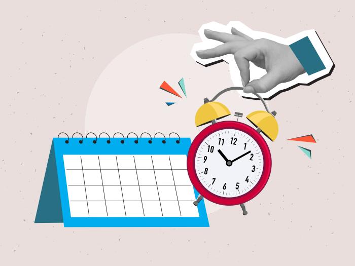
The old proverbial slow-but-steady approach is the way to go. Here’s what the SEO experts at Alt Media Studios have to share about a realistic SEO timeline.

Once you know the time of year that typically brings in the most business for you, it’s vital to capitalize on that opportunity. We have advertising and digital marketing down to a science, and we’re here to share some key tips about timing.

There’s no denying it–Search Engine Optimization (SEO) is changing. After a year of change, we’ve compiled our best practices for how to survive in a 2026 SEO landscape.