Improving your digital presence is an adventure. Let us guide you through it.
Contact us using the form below and one of our team members will reach out as soon as possible.
(*) - Required field

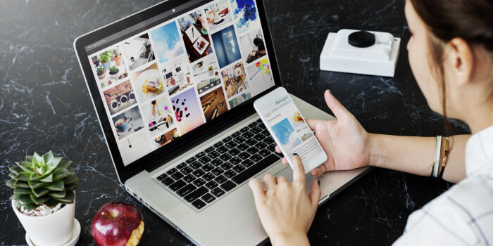
Did you know that your website may get more traffic on mobile devices than on desktops? We‘ll ensure that your site content is optimized for a friction-free experience wherever your visitors are browsing.
Whether a user is viewing a website on their desktop, tablet, or mobile device, responsive web design automatically adjusts the layout based on the device’s screen size (resolution), image size, and scripting abilities. In other words, a website’s technology can accommodate the user’s preferences. This eliminates the need for a different web design and development phase for each new device released to the public.
Today, nearly 70% of all web browsing is done by a handheld device (phone or tablet). So if you don’t want to lose any potential clients, you need a great-looking website that is optimized for mobile browsing.

Looking for similar ecommerce results? Shopify can be considered user-friendly, but it's more cost-effective when set up and managed by Alt Media Studios - SEO & Shopify experts.
Optimization of images holds a critical role in enhancing the performance of your website. By tailoring your images to be web-friendly, you not only ensure swift loading times but also deliver an improved user experience.

With the endless amount of marketing options, every business owner will have to make an important decision - Do I go with traditional marketing or digital marketing? What are the differences, and what are the pros and cons of each?